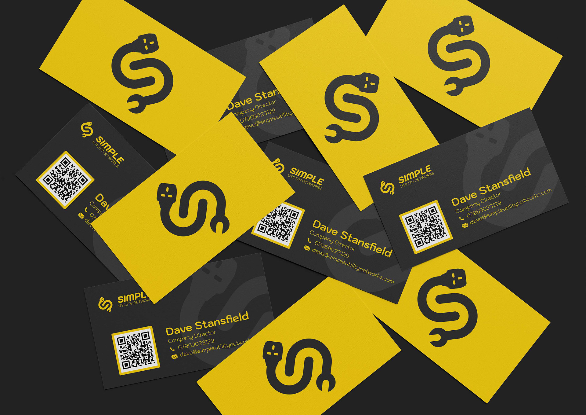

The Simple Utility Networks branding was purposefully designed to reflect the straightforward
experience they provide to their customers. The styling for their new brand gives off a slick and modern appearance that helps set them apart from competitors and makes them stand out.
experience they provide to their customers. The styling for their new brand gives off a slick and modern appearance that helps set them apart from competitors and makes them stand out.
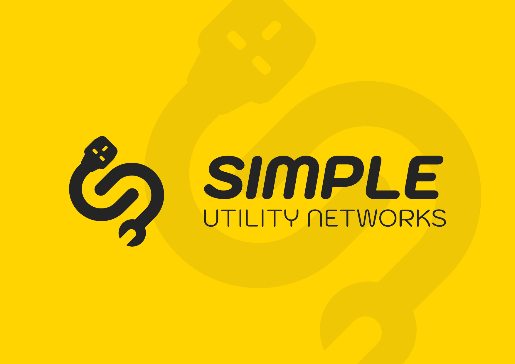
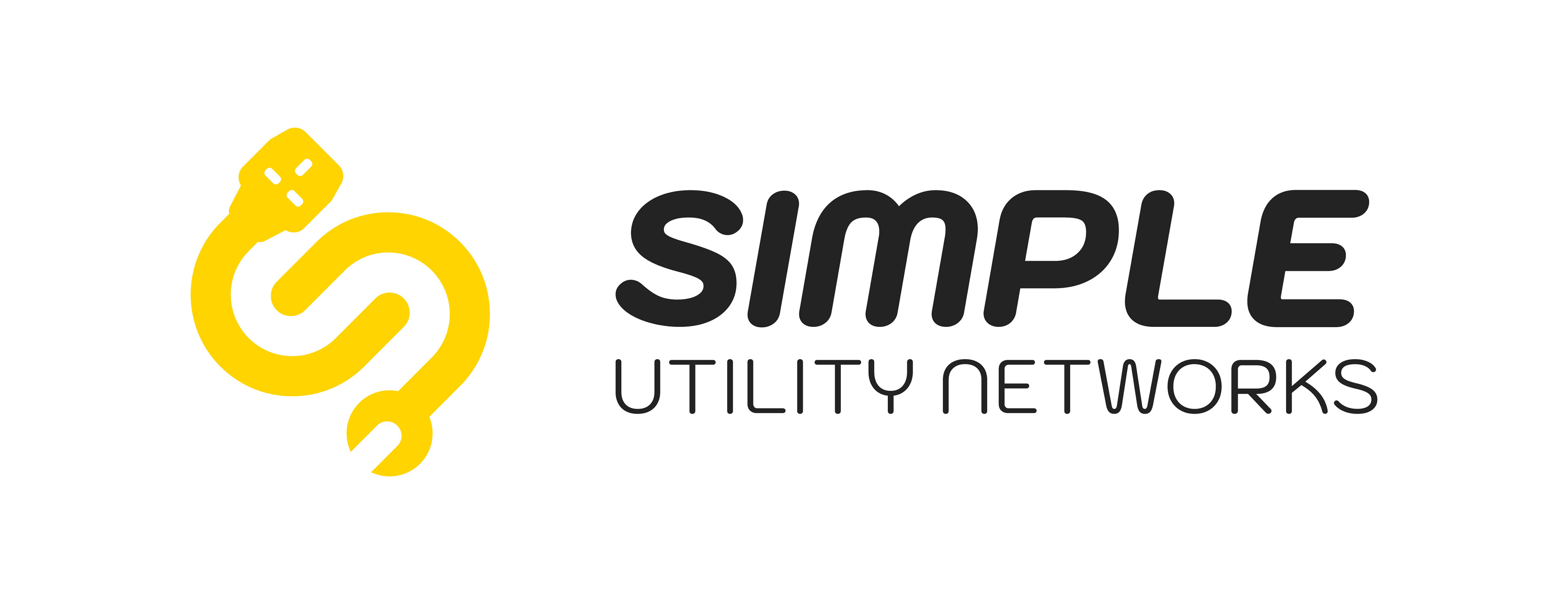


The icon uses negative space to form an ‘s’ for instant recognition, with symbols at each end highlighting the services offered by Simple Utility Networks. Interlinking lines create a sense of flow, representing how everything connects together into one complete package.